.Note: A version of this article appeared in our LinkedIn newsletter, Pricing Power Clarity®.
The “classic” price value maps – refresher & setup
In my “part 1” of this post I introduced price value maps and what they are for. This appeared originally as a guest post on CPG Data Insights. I focused on “classic” variant that consulting firms and #pricing teams routinely bring up. That default variant is the one you will likely encounter in most pricing books and websites. But is the default always the right solution for #CPG? How about other industries?
What is a “Trojan horse” pricing or analytics project?
We introduce here a punchy name for something many of us have encountered and painfully remember. The Trojan horse is the project / solution / software that we buy into because somebody made it sound like “a gift”. Or was it our own wishful thinking, often seeking relief from a major pain point? Lacking a clear understanding exactly what the “gift” is for courts trouble. Not ensuring we can operate it with adequate controls nearly guarantees it. Too often, a Trojan horse turns into surprise, hidden costs and a lesson on the risks of unchecked assumptions.
Note: Our partners at EBITDA Catalyst, in particular Armin Kakas and Christine Carragee, often write about this peril … see an excellent recent post here.
Key limitations of classic price value maps
Used properly and with clear guardrails the classic value maps can and sometimes should be part of your pricing toolset. Still, an awareness of their limitations is just as important.
They can become a pricing Trojan horse
The innocent sounding “perceived benefit” metric can serve as the Trojan for a contagious and costly consulting project. Since “perceived benefit” is a composite metric (also dynamic over time), it requires a methodology, surveys, scorecards and decisions about weights of various features and benefits and which competitors to include that are non-obvious. The cost of some consulting firms providing value maps can run up quickly, especially if you come to believe you need a bunch of them all the time.
They are not scalable
Value maps generally require separate exercises for different SKUs, and may need to be repeated at various time intervals to ensure we capture changes in the relative pricing and market perceptions. For CPG or #consumerbrands that may have dozens or hundreds of SKUs in many different categories, this means the effort and expense of classic value maps may only make sense for one or a handful of “hero SKU’s”. But what about the rest of your product portfolio?
They are silent on each SKU’s actual performance & weight in the market
Simply because a product you show on a value map at a given price exists somewhere with that price, doesn’t tell us anything about how much the product is succeeding (or failing) at that price.
They are silent on which features drive how much price
The “perceived benefit” metric on the X axis groups impact from all features/benefits, with individual benefits impact differentials left in the “black box”.
They oversimplify
The “linear” assumption of the Value Equivalence Line turns out to be wrong in a fair share of cases, especially at the higher end of the price ladder.
CPG: A 90/10 alternative (or complement) for price value maps?
So what can a CPG brand do to improve on the limited optionality (and potential high cost) of classic price value maps?
CPG companies have access to richer data than most
Price value maps were not specifically invented or perfected with CPG in mind. One of the easiest ways to see that is to realize they don’t utilize the full insight value of data typically available in CPG: syndicated sales data.
The IRI/SPINS/Nielsen data includes MULO and XAOC syndication across channels, as well as channel-level rich data on total sales, $ASP, $ARP, and myriad other values for a brand’s SKUs and all their relevant competitors in such channels. Together with good granularity on dimensional characteristics and features of each SKU, this gives CPG brands something other industries would only dream of: insight not merely on what prices and benefits are, but on how each SKU is actually performing at that particular price position!
The plain and simple, anti-Trojan, CPG-flavored value … view
Consider this type of visualization of, say, SPINS data on SKUs in a certain category or subcategory where a brand has meaningful presence.
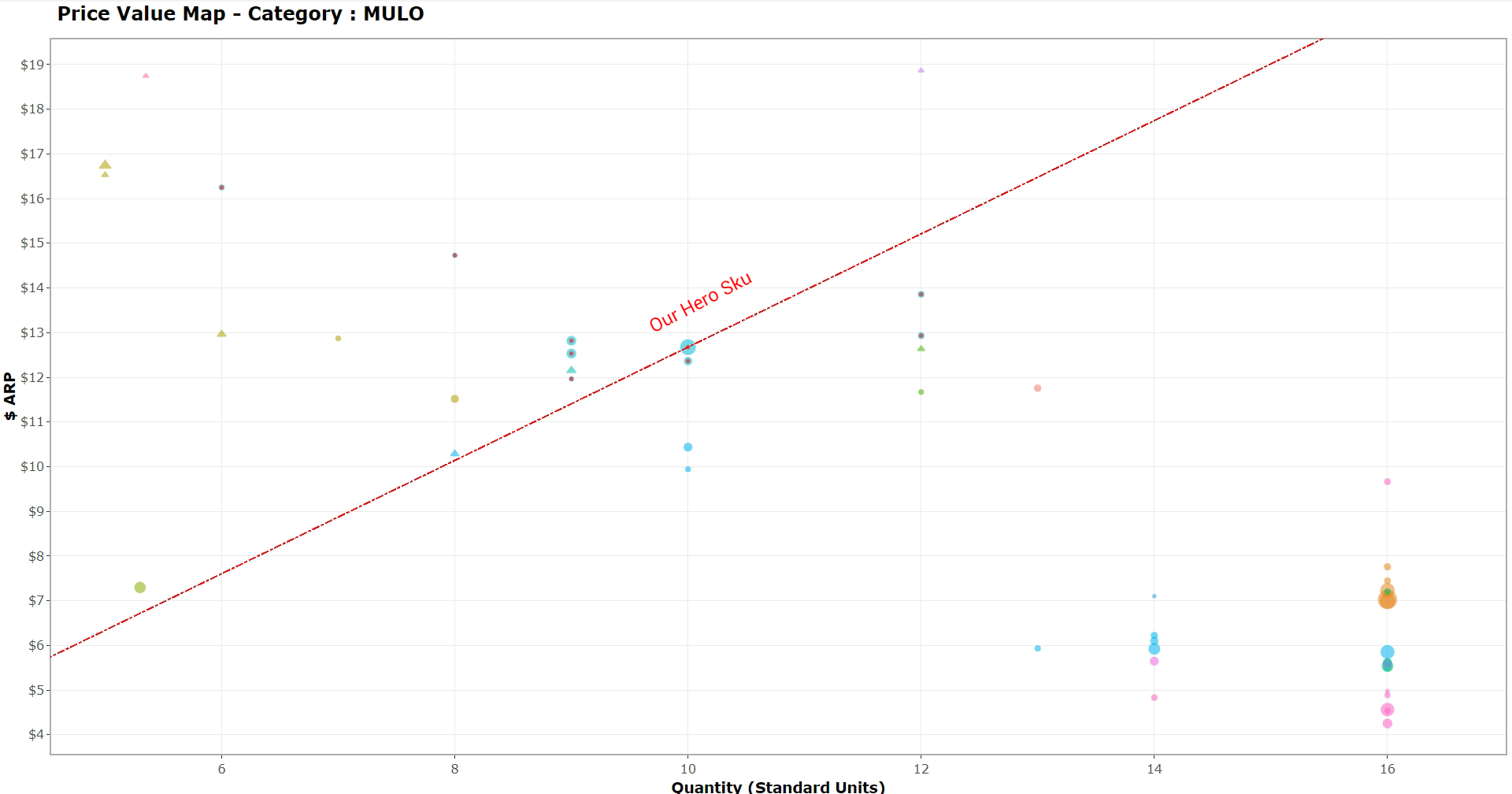
Note: In visualization tools like Tableau, R/ggplot2 and Python, hovering over each point reveals rich data about each SKU.
Legend / explanations:
- This plots $ARP (actual average realized price, net of promos etc) vs Quantity in standardized units for each SKU in the category over a threshold of sales (say, $1M/year).
- Quantity may be oz or lbs for grocery, or count for drug or personal care items, etc.
- The red line that runs through our brand’s Hero SKU in the category, is our version of “value equivalence line (VEL)”, since all points on this line have the same Price / Unit (slope) as our Hero SKU. Points above this line are more expensive, and below are less expensive, on a per-unit basis.
- Our brand’s “other” SKU’s in the category all are marked with a red dot inside. This highlights our price pack coverage and avoid visual confusion with other brands. Such brands may map to “different but too close to tell” color. We can then adjust the code to correct such an initial “lazy” version of the chart.
- Different colors map to different competitors / brands (one or several colors may be used for Private Label, or we may exclude it altogether).
- The size of the discs is the amount of $ Revenue each SKU generated over the last 12 months.
- The shape of the dots signifies the presence of special features (a round disc is the default, but a triangle may mean this offering is a gluten-free food, or some other “perceived benefit” we suspect drives differentiated pricing). Note: This of course is limited to data fields actually captured in the brand’s subscription from SPINS/IRI/NPD/Nielsen.
The value of 90/10 anti-Trojans
This simple approach to value mapping gives us nearly everything classic value maps do not. In 90/10 fashion, it makes Quantity the presumptive key perceived benefit price should be “right-sized” against. It retains flexibility to consider contribution from other value claims we can capture with the different shapes. Finally, it considers each brand’s price premiums which we can inspect via the different colors.
Let’s review its advantages:
- It’s inexpensive to build, and scalable: Since you already have the data, the code is fairly straightforward, and it can be run for as many SKU’s, subsets, categories, or choices of how to filter relevant competitors as one’s heart desires)
- It’s flexible and responsive: The inevitable “then what” questions can be answered with simple tweaks and customizations in the code
- It’s based on observed market reality: Nothing here requires opinions of consultants or fickle customer survey answers
- It quickly grounds analysis in “where is the real money”: The eye quickly zeroes in on the size of the discs and where the big concentrations of revenue are. This “size the prize first” approach may in fact help educate which of our SKUs and which of the competitors may warrant the additional work of a classic value map. If any.
- It can dynamically change in (near) real time: Once inexpensively linked to weekly/monthly data feeds, this visualization will show how any particular category or set of SKUs is evolving, without having to re-run surveys and judgments in designing value map methodology.
- It can serve as the “catch-all” analysis for non-hero SKUs: While conjoint analysis and classic value maps can help triangulate where we suspect the market pricing is off, and we have large $ stakes for our biggest SKUs, this can ground core guidance for the rest of our price pack.
- It can zero in on incremental price impact of specific value claims: As long as the data has a column for a dimension / feature of our SKUs, we can visually assess the impact on price of that variable, at least as a loose first take. Filters for the graph, or calculated tables can help us quickly tease out “what’s the average premium for gluten-free in the size bracket of our hero SKU among our top 5 branded competitors?”
Visual illustration – The CPG “Alternative” Price Value Map:
Conclusion
Even in a world of infinite resources, we would recommend considering this kind of visualization. They can be a precursor or supplement to classic value maps and choice-based pricing research like conjoint. Alas, not even the giants of CPG live in such a world. Whether Procter & Gamble or General Mills, firms constantly spawn out new SKU’s. In new brands/categories/niches or in the established brands’ price pack architectures, growth happens. Whether an industry leader or a middle-market player / challenger with limited pricing research resources, you need scalable answers. I hope the advantages of starting with the less expensive, easier scalable tool are obvious.
In fairness to classic price value maps, their risk of becoming costly Trojans are ultimately manageable. You have control over asking upfront the questions that will limit contagion. You can do 90/10 work with alternatives like our variant to minimize the need for them. If you have consulting partners to assist, you have control over selecting reasonable priced options. Finally, you can ask for terms that protect you from Trojan creep.
The best strategy to higher ROI from pricing work rests with your other gift, the one you already possess. That gift is a mentality that seeks the 90/10 relentlessly, regardless how intriguing the new object of the week is.
Did you enjoy this post? Stay in touch!
- Don’t forget to hit the “Subscribe” button. (100++ curious minds join our newsletter every week!)
- Tap my profile bell to catch the next post that is “not” in the newsletter! Here’s how (LinkedIn cool feature I didn’t know about either until recently)
- Follow EBITDA Catalyst